Logo Designs - Grant Works
Vintage - Compact - Flowing - Stylized
Vintage - Compact - Flowing - Stylized
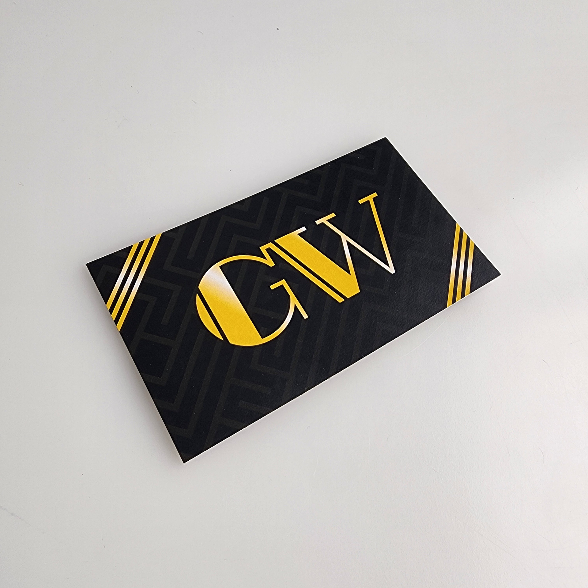
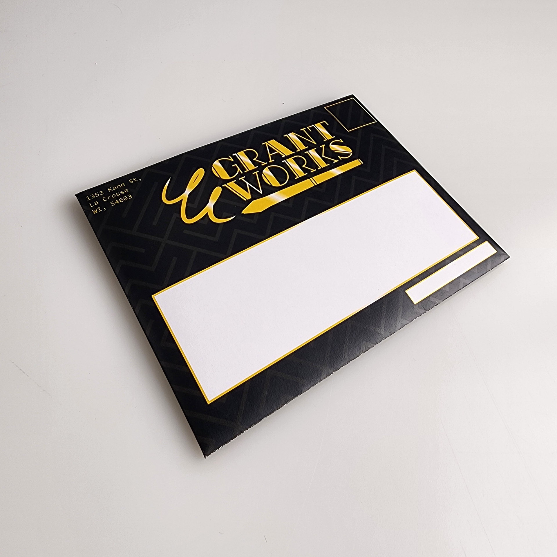
For My Four Traits I chose; Vintage, Compact, Flowing, and Stylized. This design executes all 4 of the traits pretty well. The vintage trait is shown in the Art Deco font - Rialto NF, and gives off a swing/1920's feeling. The logo is fairly compact with its horizontal orientation, and the closeness of the top word and bottom word. The pen underneath also supports this as a sort of underline to the words above. I was unsure when I first decided flowing should be part of my traits but I think I got the right amount with the pen stroke on the left. Stylized was a tough nut to crack as its a very vague adjective. I went with the thought of combining both vintage and stylized as one with the 1920's aesthetic, as when swing music fonts were established, it all gave the same feeling of, "This is the Roaring 20's."
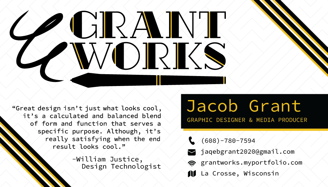
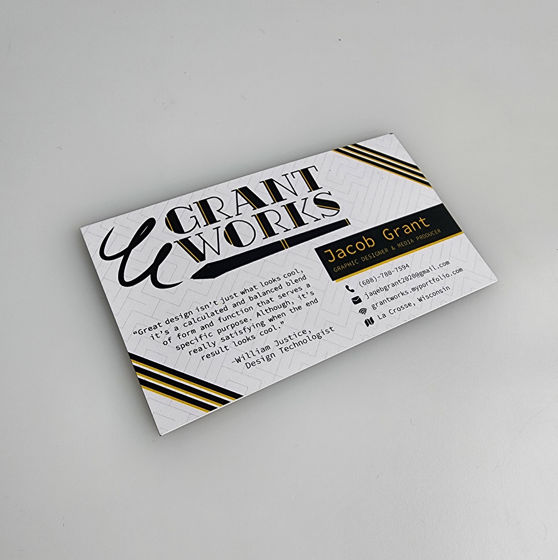
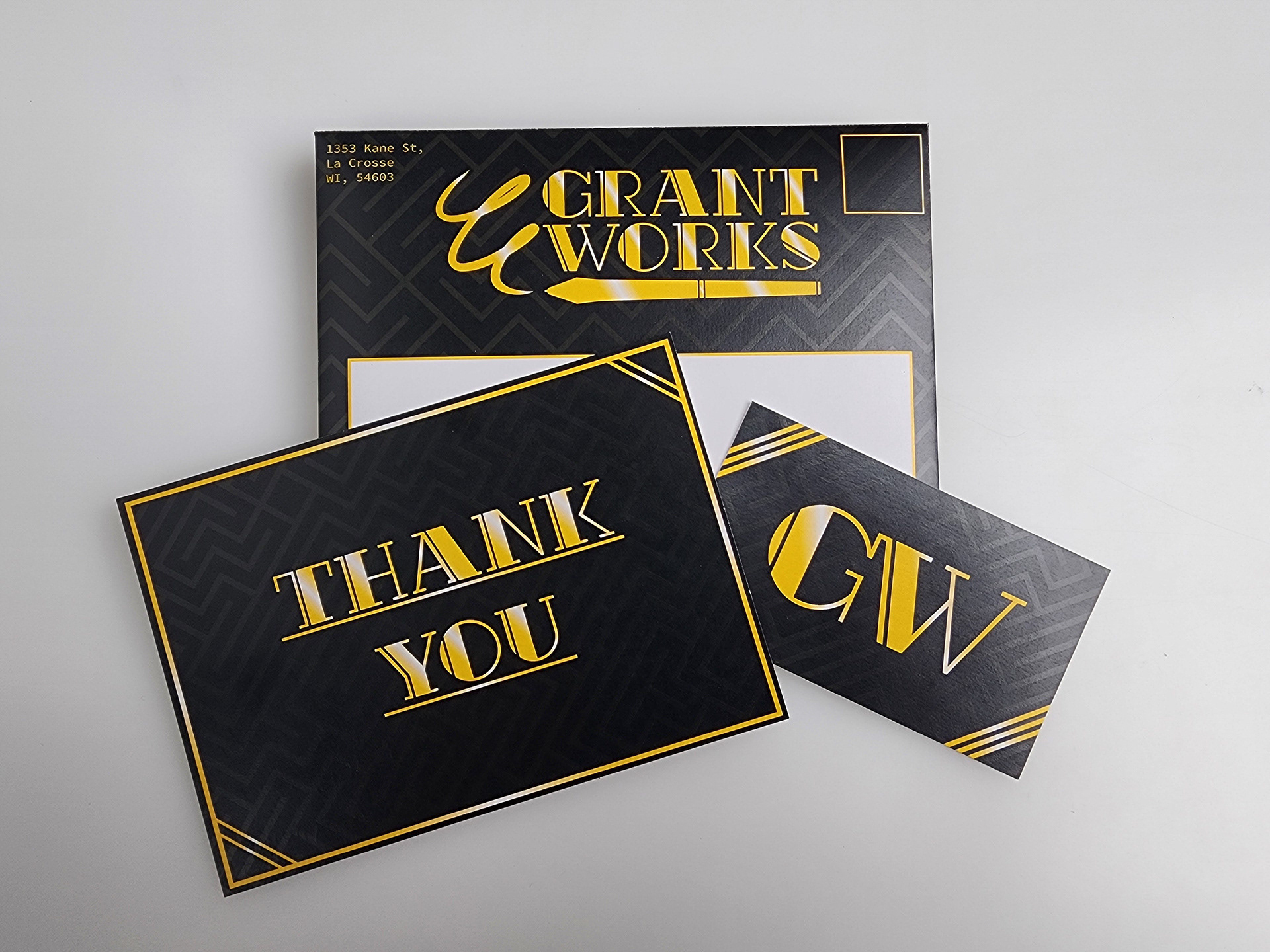
Business Card
Front & Back

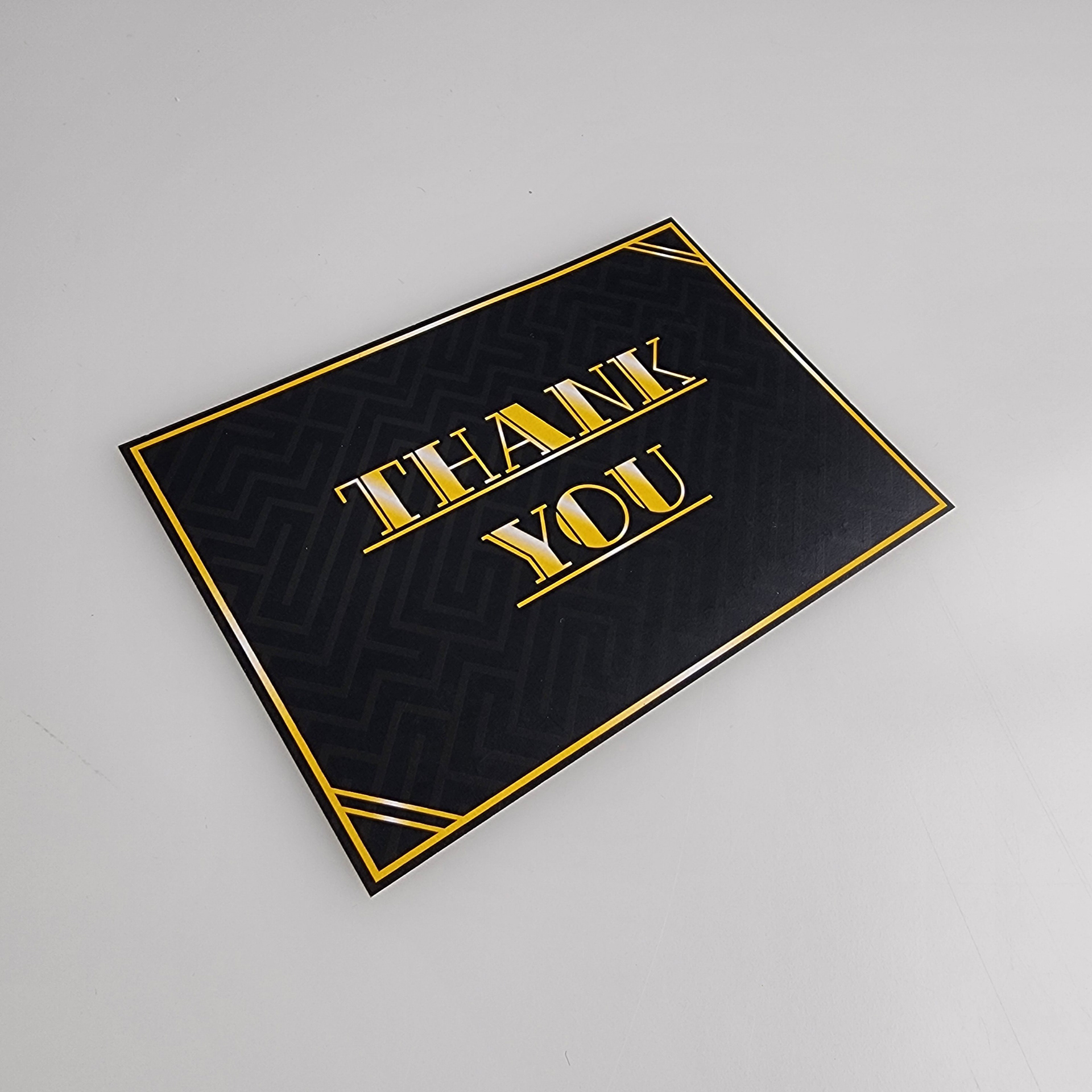
Thank You Card

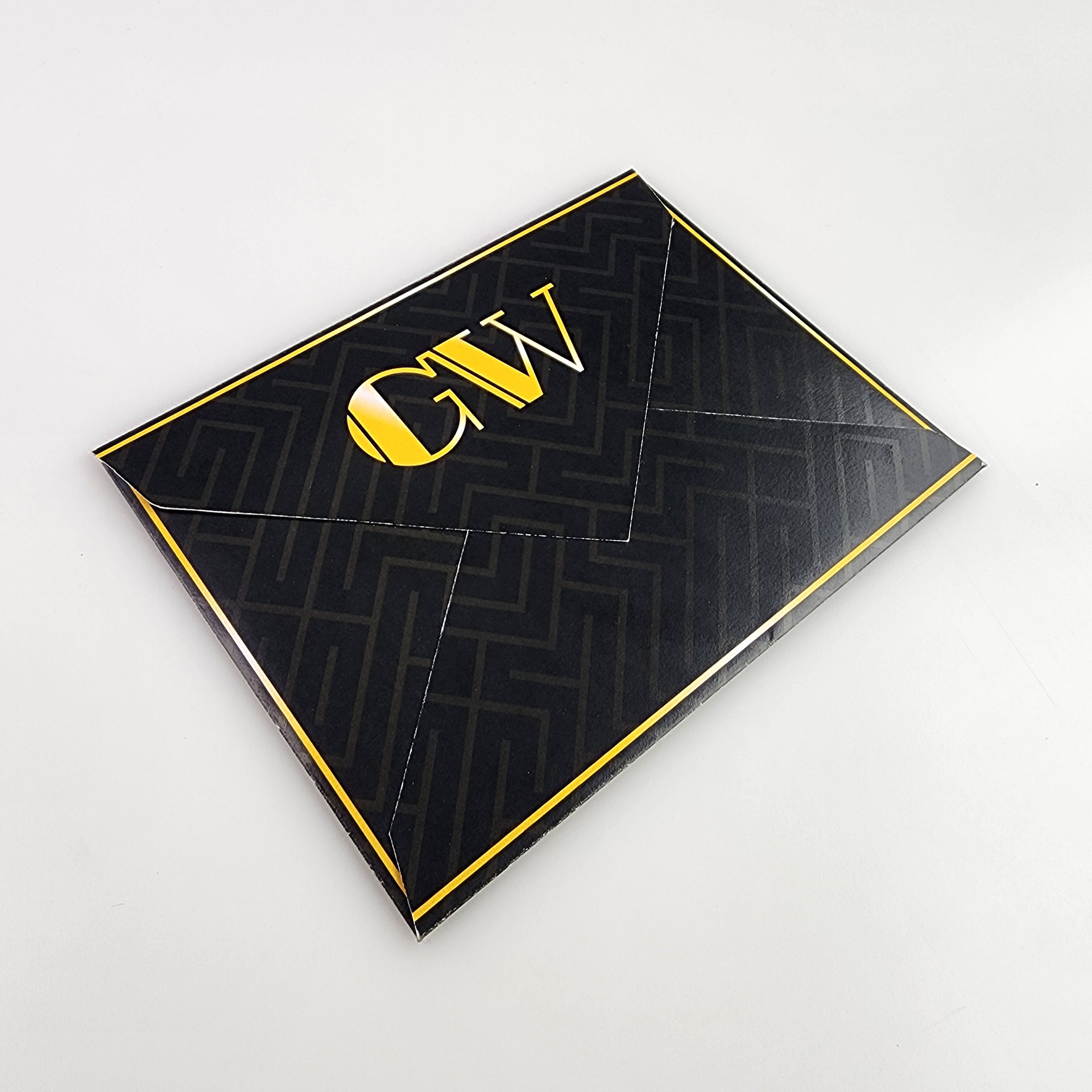
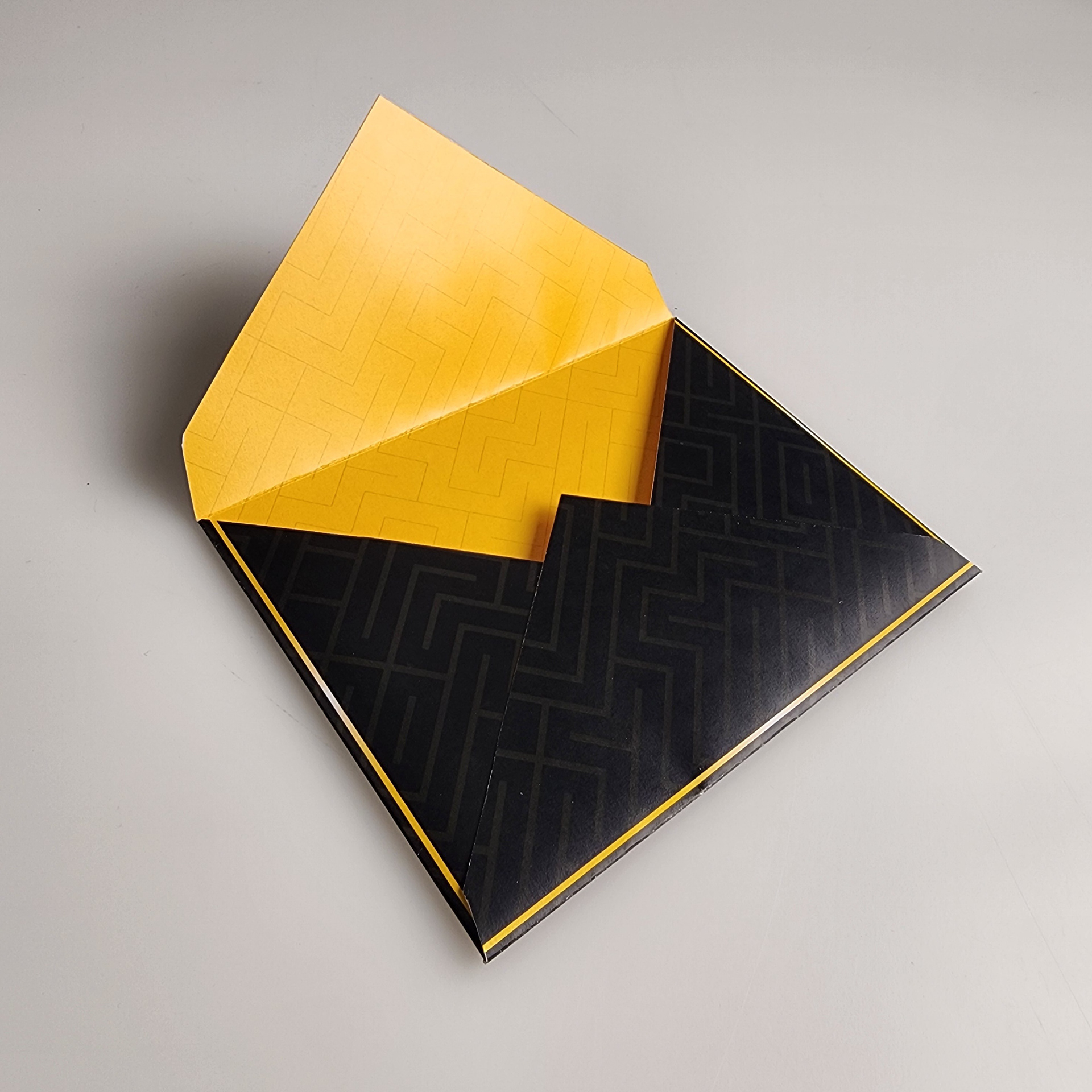
Envelope
Animation
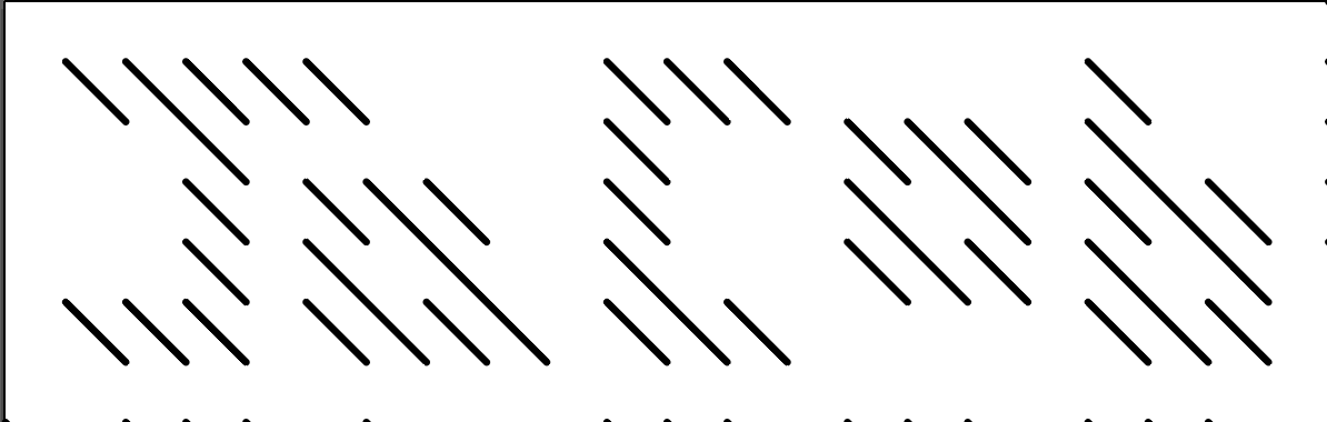
Fun fact!
The pattern you see being used in the background of most of these designs is a complete pattern made by hand! As someone once told me to share, my family is very important to me so I chose to implement them in this pattern.
Every \ line makes up a letter, and every / Line is empty space in a grid. I put all of my close family's names in this pattern. This creates that maze like effect.